ASSIGNMENT 3
Visualization Critique & Redesign
Zhi Ray Wang, MIT Spring 2025
zrwang@mit.edu
Visualizing COVID-19 Cases in the US
Dataset Overview
The dataset for this exercise is a day-by-day snapshot of COVID-19’s progression in the United States, capturing both daily and cumulative figures for confirmed cases, deaths, recoveries, and tests administered. For each date, we can see how many new infections were recorded, how many new fatalities occurred, and how many individuals recovered. Meanwhile, it also gives insight into testing activity on that particular day. The dataset also includes cumulative tallies—which allow us to track the total impact of the pandemic over time rather than just its day-to-day fluctuations.
Critique by Redesign
In this exercise, I aim to engage with the method, “critique by redesign,” by closely examining an existing design and then suggesting targeted improvements based on its shortcomings and potential growth areas. Rather than stopping at pointing out what might be flawed, I plan to go a step further by proposing concrete, constructive changes that can help develop new ways of visualization. This process allows me to take a hands-on role in shaping a new, more user-centered experience, while simultaneously honing my ability to recognize design opportunities. Through this approach, I hope to illustrate how critique can become a positive, forward-looking act that fosters both insight and innovation.

Original Visualization by Dr Jeffrey Shaman, New York Times
COVID’s Spiral Story: Visualizing Seasonal Waves and Surges
This spiral chart, originally published in a New York Times opinion piece by Dr. Jeffrey Shaman, succeeds in catching a reader’s eye and conveying that COVID-19 cases have waxed and waned over multiple years. The concentric layout underscores seasonality and draws attention to major surges, which may help viewers grasp big-picture trends even at a glance. Visually, it’s memorable—qualities that can sometimes be lost in more standard line or bar charts.

Sketch by the Arthor
On the other hand, the design could more directly show key takeaways and more solid manifestos. The irregular scale makes it hard to compare month-to-month case counts precisely, and the overlapping spirals obscure smaller but still important fluctuations. Clearer labeling (both temporal markers and case-count ticks) and a legend explaining how the 7-day average or raw counts are encoded would help viewers orient themselves more quickly. Additionally, while the spiral format emphasizes the cyclical nature of the pandemic, it risks “hiding” some data behind the shape’s novelty.
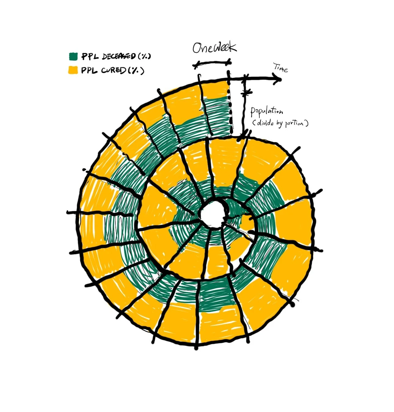
Sketch 1: Spiral Chart
Initial Sketches: Redesigning Visualization for COVID-19
In this spiral chart, I plan to make each weekly segment more visually distinct—perhaps by highlighting the dividing lines or adding labels that clearly mark the boundary of each week—so that viewers can easily tell where one week ends and the next begins. Each “ring” in the spiral will also accommodate multiple data values, such as different metrics (cases, deaths, or hospitalizations) recorded during the same week or month, providing a richer snapshot of the data without requiring multiple charts.

Sketch 2: Pictogram Charts
Each icon—in this case, a stylized human figure—represents a data unit, such as one person or a set number of people. When used to illustrate COVID-19 deaths, for instance, each figure (or row of figures) corresponds to fatalities over a particular time period (such as a week), and applying a color gradient helps highlight changes in the number of deaths as the weeks progress. Because it uses recognizable icons rather than abstract shapes, a pictograph chart can make data feel more immediate and relatable, though it usually works best when the data isn’t so large as to become visually overwhelming.

Sketch 3: Stacked Bar Charts
The stacked bar chart offers the most straightforward, accessible way to display different components of a dataset, making it generally more readable at a glance. Each segment of the bar adds up to a total, which can be easily compared from one-time point to the next. However, while this format excels at clarity and simplicity, it may not deliver the same quality of creative visual impact or emotional resonance that more unconventional designs can offer. In other words, it’s reliable for conveying quantitative breakdowns. Still, it may feel less dramatic or evocative when the goal is to emphasize the severity or human stories behind the numbers.

.
Mirrored Chart with New Deceased and New Recovered
Exploratory Visualization: Dual-Stacked Bar Chart
The mirrored bar chart presents a temporal comparison between new recoveries (plotted upward) and new deaths (plotted downward) throughout the pandemic. One of the most prominent features is the dramatic spike in new recoveries around late 2020 and early 2021, followed by an abrupt and prolonged drop to near-zero levels. A similar decline is seen in the reported deaths. These sudden and sustained plateaus suggest that the issue lies not in real-world trends, but likely in missing or incomplete data reporting during this period.
This format was chosen to explore temporal symmetry and emphasize the relationship between recoveries and deaths over time. The mirrored layout helps reveal discrepancies between the two metrics and makes anomalies—such as the prolonged flatlines—immediately visible. While the visualization accurately reflects the dataset, the visual pattern strongly indicates potential gaps or breakdowns in data collection, likely due to changes in reporting standards, a shift in how “recovery” was defined, or inconsistent updates from local jurisdictions. Without confirmation of data continuity, these zeros should be interpreted with caution. In this case, the visualization does not just reveal trends—it surfaces the limitations and uncertainties of the underlying dataset.

Circular Chart of COVID-19 Confirmed and Deceased Cases in the U.S. (Feb 2020 – Feb 2022)
Final Re-Visualization: Dual Circular Chart
This circular chart visualizes the cumulative growth of COVID-19 confirmed cases and deaths in the United States from February 2020 to February 2022. The outer ring, shown in red, represents the rising number of confirmed cases, while the inner, inverted ring in black reflects the cumulative death toll. Each radial segment corresponds to a single month, arranged clockwise to reflect the pandemic’s unfolding over time. Dashed circular guides provide clear, proportional reference points—ranging from 15M to 75M for confirmed cases and up to 1M for deaths. Unlike the original spiral chart from TIME Magazine, which exaggerated visual scale for dramatic effect, this re-visualization maintains linear radial scaling, enabling more accurate comparisons across months.
One key improvement over the TIME graphic is the emphasis on clarity and proportional integrity. While the original spiral created a powerful sense of urgency, it compromised readability by introducing distortion as the spiral expanded. My redesign adopts a fixed-radius circular format, preserving the rhythmic passage of time while ensuring that both confirmed and deceased cases can be read on consistent scales. The clean month-by-month segmentation and removal of cluttered annotations allow the data itself to speak. That said, this approach introduces new design considerations: for example, the inner ring’s inverted scaling had to be adjusted independently to maintain visual balance and legibility alongside the outer ring. Despite these trade-offs, the chart prioritizes simplicity, proportional accuracy, and a minimalist aesthetic—offering a clearer, more objective narrative of the pandemic’s progression.